Brand Family
Techie Club → Spatial Design Club
Techie Club is our parent brand — a nerdy publication and community for having fun with creative technology. It has a visual identity built on hand-drawn illustration, retro tech nostalgia, and soft pastel warmth.
Spatial Design Club inherits that DNA but has its own personality. Think siblings, not clones.
Techie Club
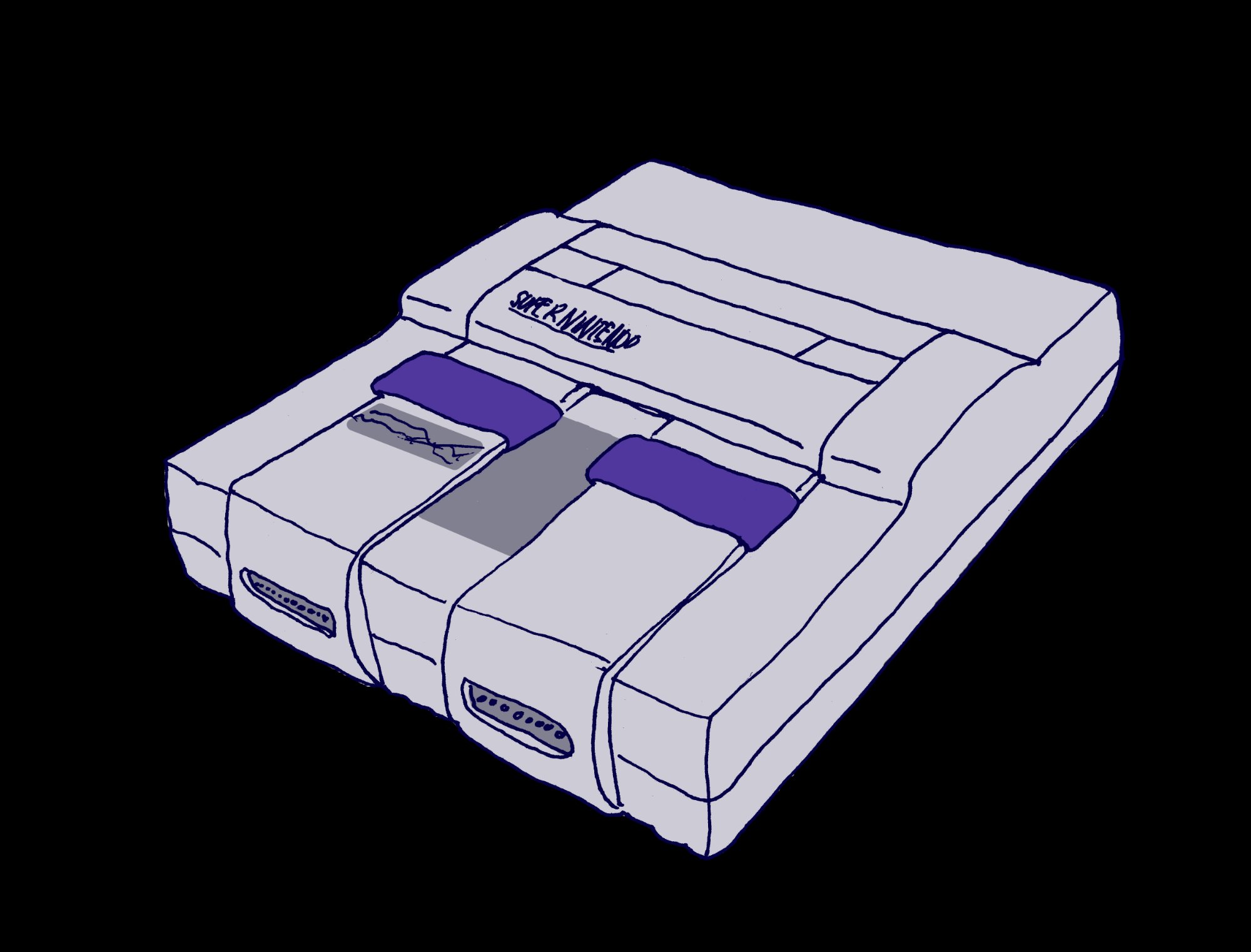
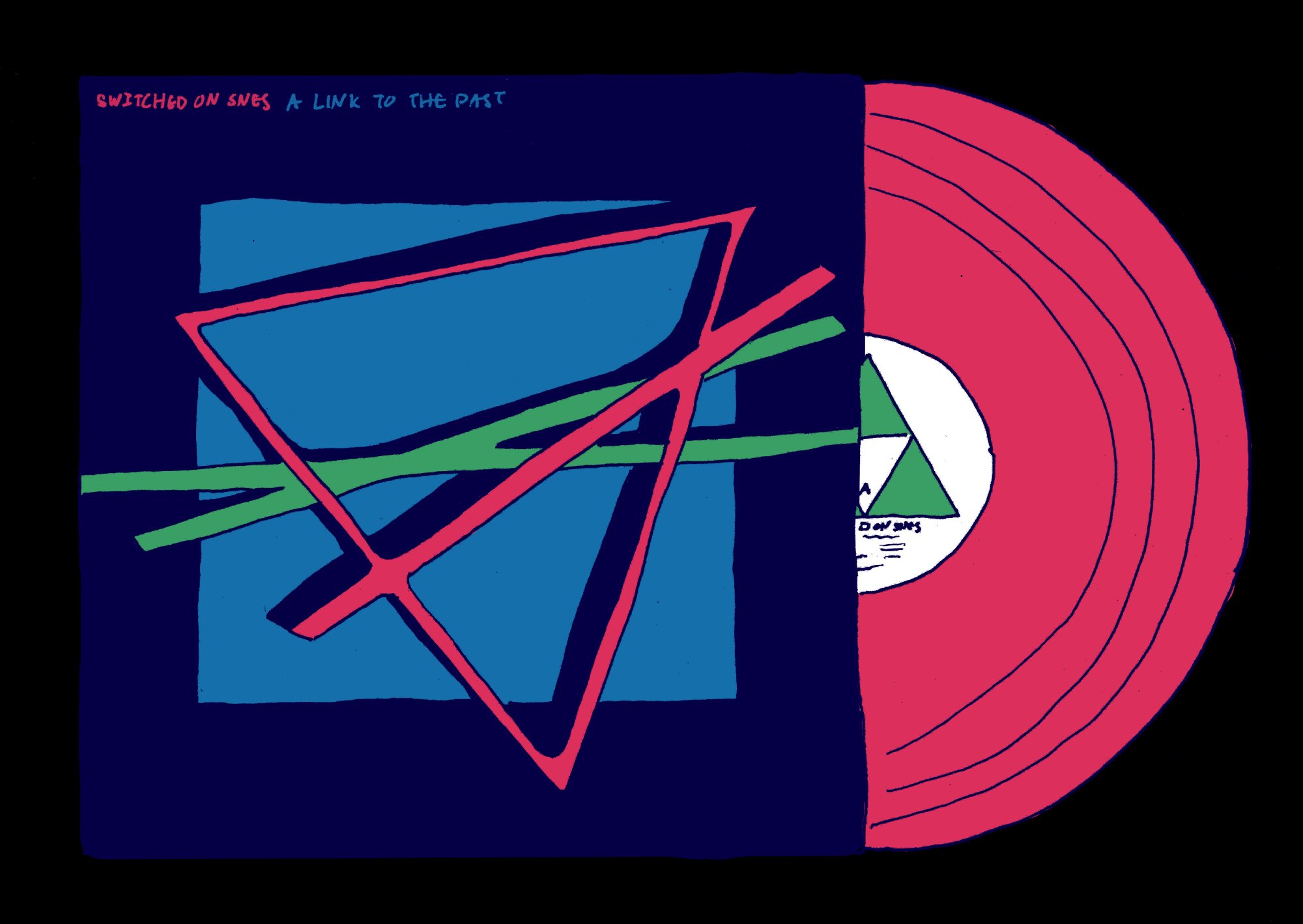
Nerdy zine energy. Retro tech objects drawn with love: SNES, CRT monitors, vinyl. Playful chaos.
Spatial Design Club
Creative studio energy. Spatial tech drawn the same way: headsets, 3D objects, AR. Playful focus.
What SDC inherits
Where SDC gets its own identity
Place: SDC logo (to be designed by Mina) — Should feel like a sibling to the TC computer. Maybe a headset, holographic display, or spatial interface in the same style.
SDC logo — TBD by Mina
Color Palette
Our colors feel like a warm hug
Extracted from the Techie Club illustrations. Soft pastels set the emotional base. Deep navy grounds everything — we never use pure black.
Primary
Lavender
#B8A0D8
The emotional center
Cornflower
#7BAFD4
The screen
Soft Pink
#F5D2E0
The warmth
Secondary
Deep Navy
#1A1550
The ink (never black)
Rose Pink
#E8578A
Accents & energy
Warm Blush
#FDE8F0
The canvas
SDC Accent
Mint
#7DD4B8
Spatial, fresh, new
Soft Lilac
#E0D4F5
Layering & depth
Lavender Mid
#C9B8F0
Between states
Extended (from illustrations)
Emerald
#3D9B5E
Coral
#E85A6B
Warm Gray
#C8C0D0
Honey
#E8C547
Color rules
Typography
Three fonts, infinite warmth
Display / Headlines
Nunito Black
Rounded, bold, friendly.
Use at 700–900 weight for headlines and section titles. The rounded terminals make it feel approachable without being childish. Don't be shy with size.
Body Text
Lexend Deca
Clean, humanist, highly readable. Designed for comfortable reading at any size. This is what you're reading right now.
Never smaller than 14px on screen. Readability is accessibility.
Monospace / Technical
Space Mono
Labels, dates, tags, version numbers, code references. This bridges retro-tech nostalgia with functional design.
Type rules
Headlines bold and confident — 800–900 weight is the sweet spot
Monospace for labels and metadata — creates the nerdy-publication feel
Vertical text is a TC signature — rotated sidebar text for decoration
Uppercase labels get 0.1–0.18em letter-spacing — keeps them from feeling aggressive
Illustration Style
Hand-drawn is the whole soul
This is the heart of the brand. The illustration style is what makes Techie Club (and SDC) feel like nothing else out there. Technology drawn with love, slightly imperfect, always warm.
Core characteristics
Hand-drawn ink linework
Slightly uneven, natural weight variation. Drawn by a human hand, not vector-perfect.
Deep Navy outlines
#1A1550 — never black. This is what makes everything feel soft.
Flat color fills
No gradients within illustrations. Flat and slightly imperfect, like marker or screenprint.
Slightly loose registration
Color doesn't always perfectly meet the line. This imperfection is the charm.
Tech drawn with affection
A SNES, a vinyl record, a CRT. For SDC: headsets, 3D objects, spatial grids.
Do ✔
Draw tech as if you love it
Let linework be imperfect
Use the brand palette for fills
Mix retro + spatial tech refs
Make it feel like a zine/sticker
Don’t ✘
Use photorealistic renders
Use AI-generated illustration
Use perfect vector shapes
Use gradients in illustrations
Use black for outlines
Graphic Elements
The little things that make it ours
The Grid
Soft graph-paper texture. 16–20px intervals, 5–8% opacity. Signature background element inherited from Techie Club.
Browser Window
Illustrated browser frame with colored dots (pink, honey, blue) for featuring content. A TC signature.
Pixel Dots
Small 4–10px squares with 2px radius. Decorative accents scattered playfully. 8-bit energy.
The Cursor
Oversized white arrow with dark outline. A TC signature. SDC uses it as an occasional nod, not primary element.
Voice & Tone
How we talk
The voice of a friend who's genuinely excited about creative technology and wants you to be excited too — without ever making you feel like you should already know things.
Warm
not corporate
Knowledgeable
not gatekeeping
Playful
not childish
Honest
not polished
Instead of... we say...
"Welcome to our platform"
"Hey, come on in"
"Create immersive XR experiences"
"Make art you can walk inside"
"Utilize our suite of tools"
"Grab a tool and start making"
"We're disrupting the XR space"
"We're building something for artists"
"Error 404"
"Oops, that page wandered off"
Layout
Spacing, radius, precision
Border Radius
4–6px
Tight and precise, not blobby
Card Padding
20–32px
Room to breathe inside
Grid Gap
8–12px
Cozy, not cramped
Section Spacing
64–80px
Clear separation
Content Width
680–720px
Comfortable reading
Min Font Size
14px
Accessibility baseline
For Mina
This is your starting point
These guidelines are a foundation, not a rulebook. As branding lead, you're empowered to evolve, refine, and push all of this further. The goal is to give the team a shared language right now while leaving plenty of room for your creative direction.
Study these guidelines + TC assets. Research parent/sub-brand relationships. What feels right for SDC?
Develop the SDC logo concept. Refine the palette. Write the "this, not that" brand statements.
Finalize logo. Build a 1-page brand sheet for the team. Create templates for Hudson's campaign.
Share branding externally. Does it read as “creative XR tool for artists”? Refine based on feedback.
Final brand package. Everything at the launch party carries this identity.